

The Problem: Why Choosing Kitchen Colors Feels So Difficult
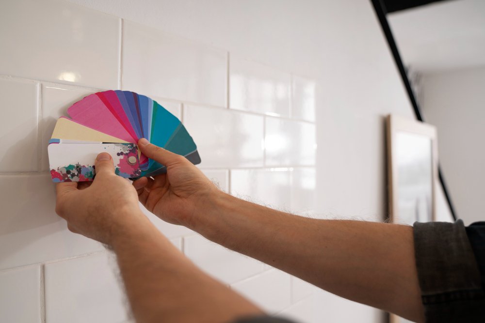
One of the biggest challenges homeowners face is the sheer number of available choices. A cabinet color that looks perfect in a showroom may appear completely different inside your home, while a countertop sample that seemed subtle under store lighting can suddenly become the dominant feature once installed.PROBLEM
A kitchen color that looks beautiful in a showroom may appear completely different once installed under your home’s natural and artificial lighting conditions.
Another common difficulty is trying to evaluate each finish separately. Paint colors are often selected before countertops, hardware before cabinetry, or backsplashes before flooring. Although each decision may seem reasonable on its own, the finished kitchen can lack visual harmony when these elements aren’t planned as a complete design.
Homeowners also face constant exposure to changing design trends. Social media, home improvement television, and online galleries introduce new color combinations almost daily. While these ideas can provide inspiration, they can also create uncertainty about whether to choose timeless neutrals or follow the latest trend.
The result is often hesitation, repeated changes during the planning process, or expensive modifications after installation begins.
Why It Happens
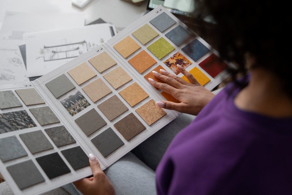
Kitchen colors rarely exist in isolation. Every surface influences how surrounding colors are perceived, making the overall palette more complex than many homeowners initially expect. Lighting is perhaps the most significant factor. Natural daylight changes throughout the day, while warm and cool artificial lighting can dramatically alter the appearance of paint, cabinetry, and countertops. A soft gray cabinet may appear warm in the morning, neutral in the afternoon, and noticeably cooler in the evening. Material selection creates another layer of complexity. Quartz countertops with subtle veining, richly stained wood cabinetry, textured tile backsplashes, and flooring each contribute their own undertones. If these undertones aren’t coordinated, even expensive materials may compete instead of complementing one another. Room size also affects color perception. Lighter finishes generally reflect more light, helping smaller kitchens feel larger and brighter. Darker cabinetry can introduce elegance and depth, but without adequate lighting or balanced contrast, it may make a compact kitchen feel more enclosed. Finally, personal preferences often evolve throughout the remodeling process. Homeowners may begin with one vision, discover a different countertop they love, and then attempt to redesign the rest of the kitchen around that single change. Without an overall plan, the palette can gradually lose cohesion.Common Mistakes
Fortunately, many disappointing kitchen color combinations can be traced back to a handful of avoidable decisions. Recognizing these mistakes early allows homeowners to make more confident choices before construction begins. One of the most frequent errors is selecting wall paint before choosing permanent materials. Paint is one of the easiest elements to change, while cabinetry and countertops represent much larger long-term investments. Designing in the opposite order often limits your options later. Another mistake is introducing too many competing colors. Although it’s tempting to incorporate several favorite shades, excessive variation can make the kitchen feel visually busy rather than sophisticated. Successful color schemes for kitchens typically rely on a dominant color supported by one or two complementary accents. Ignoring undertones is equally common. Two whites, two grays, or two beige finishes may appear similar until they’re installed side by side, revealing warm, cool, pink, blue, or green undertones that create unintended contrast. Many homeowners also underestimate the importance of lighting when evaluating samples. Viewing a cabinet door or paint swatch under showroom lighting alone rarely provides an accurate representation of how it will appear inside the finished kitchen. Following trends without considering your home’s overall style is another pitfall. A color palette that looks striking in a designer showroom may not complement your home’s architecture, existing flooring, or adjoining living spaces. The most successful kitchens feel connected to the rest of the home rather than completely different from it. Finally, many remodeling projects overlook long-term practicality. Bold colors can make a dramatic statement, but homeowners should also consider how those choices will feel years later, especially if resale value is an important consideration.The Solution: Building a Color Scheme That Lasts
The most effective way to create timeless color schemes for kitchens is to build the palette in a logical sequence instead of making isolated design decisions.
SOLUTION
Build your color palette around permanent materials such as cabinetry and countertops before selecting paint, hardware, lighting, and decorative accessories. This approach creates a more cohesive and balanced kitchen design.
Begin with the largest visual element—typically the cabinetry. Cabinet color establishes the overall mood of the room and influences nearly every other design decision. Once cabinetry has been selected, choose countertops that complement rather than compete with those finishes. Finally, introduce backsplashes, wall colors, lighting, and decorative accents that reinforce the overall palette.
Limiting the primary palette to two or three dominant colors often produces the most elegant results. Contrast can then be introduced through textures, hardware finishes, wood grain, or subtle accent colors instead of overwhelming the room with multiple competing shades.
Equally important is evaluating samples inside your own home. Observe cabinet doors, countertop samples, and paint colors during the morning, afternoon, and evening. This simple step reveals how changing light conditions influence the overall appearance and helps prevent costly surprises after installation.
Read More in Kitchen Promise Blog
- Built-In Bar Cabinets: A Step-by-Step Guide to Planning the Perfect Home Beverage Station
 Discover how to plan built in bar cabinets that combine style and functionality. Follow this step-by-step guide to choose the ideal layout, storage, appliances, and finishing details.
 - Kitchen Remodeling Services in Granite, ID: Create a Functional and Beautiful Gathering Space
 Learn how modern kitchen renovations transform everyday living with smart layouts and efficient upgrades.
 - How to Renovate a Dining Room for Better Functionality and Style
 Dining room renovations improve comfort, organization, and entertaining functionality. This guide explains lighting, storage, acoustics, layout planning, and modern design strategies for stylish and practical dining spaces.
Before & After: A Better Color Planning Strategy
| Before | After |
|---|---|
| Selecting finishes independently | Planning one coordinated color palette |
| Following short-term trends | Choosing timeless combinations |
| Ignoring lighting conditions | Testing colors throughout the day |
| Too many competing finishes | Balanced materials and complementary textures |
| Reactive design decisions | A structured remodeling plan |
Best Practices
Professional kitchen designers rarely rely on individual colors alone. Instead, they create layered compositions where cabinetry, countertops, flooring, backsplashes, lighting, and hardware work together as a complete design. To achieve the same effect, keep these recommendations in mind:- Choose permanent materials before selecting paint colors.
- Limit the palette to two or three primary colors.
- Use texture and finish to create interest instead of adding extra colors.
- Evaluate samples under your home’s actual lighting conditions.
- Consider how the kitchen connects visually with adjacent living spaces.
- Balance current design trends with long-term appeal.